If you've searched "therapist website examples" before, you already know the problem.
Most lists show you a screenshot, say "look how pretty," and move on. That's not particularly useful. You can't build a therapist website template or a fully custom site off a screenshot and a compliment.
So here's what we're doing differently: we pulled together every strong, currently-live therapist website we could find 16 in total and we're taking each one apart: the design, the copy, the booking flow, and (because we're a healthcare marketing agency, not just a design blog) the SEO and technical decisions most "therapist website design" articles never mention.
We also checked that every single site on this list is actually live before writing a word about it. You'd be surprised how many "best therapist website" roundups link to sites that quietly went offline years ago.
By the end, you'll have a real framework for what makes a therapist website actually convert not just look nice in a portfolio.
16 Therapist Website Examples
1. Deep Eddy Psychotherapy
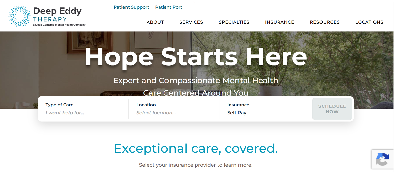
Deep Eddy Psychotherapy's homepage does something most therapist websites get wrong: it leads with a specific, local, confident message instead of a generic mission statement. Their hero section states plainly that they're Austin's centre for psychotherapy, in business for over 30 years, with a mission built around heart-centred work grounded in cutting-edge science.
What works:
- Location and years-in-business are stated immediately this builds authority in the first five seconds
- The mission statement is specific enough to be memorable, not generic enough to be forgettable
- A contact button sits directly below the message, so there's zero scrolling required to take action
SEO note: Naming your city in your hero copy (not just your footer) is a small but real win for local SEO it reinforces geographic relevance right where Google (and readers) look first.
What could improve: Their services page is currently organised around fees rather than treatment types, which can confuse a visitor who clicked "Services" expecting to see specialties like anxiety, trauma, or couples therapy.
2. Couples Learn
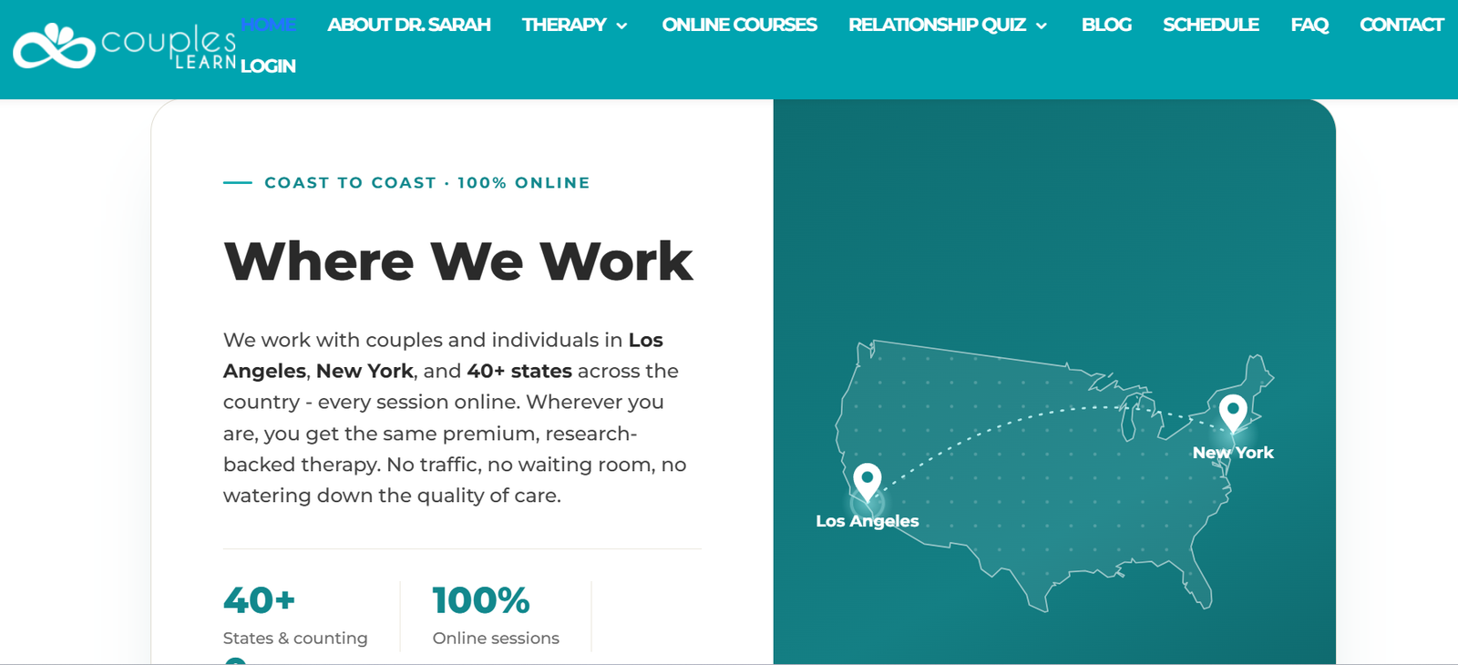
Couples Learn gets something right that almost no other therapist site on this list does: curated, in-depth reviews paired with a visible HIPAA and GDPR-compliance badge.
What works:
- Reviews aren't auto-pulled and dumped on the page they're hand-selected, detailed, and specific about the actual experience of working with the practice
- The HIPAA and GDPR badge sits near the booking CTA, reassuring visitors before they enter any personal information
- A short intro video humanises the practice without requiring a full "About" page read
What could improve: Nothing structurally major this is genuinely one of the stronger examples on the list, and a good benchmark to hold your own site against.
3. Wholeness Collective Therapy
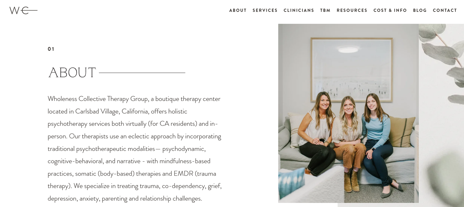
If you're specifically looking for colour palette inspiration, this is the one to study. Wholeness Collective uses a soft, consistent colour scheme and a floating header that keeps navigation and contact info visible without forcing visitors to scroll back to the top.
What works:
- A soothing colour scheme creates a more pleasant, lower-stress atmosphere for visitors already feeling anxious about reaching out
- A homepage contact form means someone ready to act doesn't need to hunt for a separate contact page
- The floating header keeps the "Book Now" button in view at all times a small detail that removes real friction
This is also a good example for group practices specifically, since the same layout and structure would work well for a web design for counsellors build with multiple practitioners under one roof.
What could improve: With a floating header taking up permanent screen space, mobile visitors lose valuable content real estate worth testing a collapsed version on smaller screens.
4. Ikigai Integrative
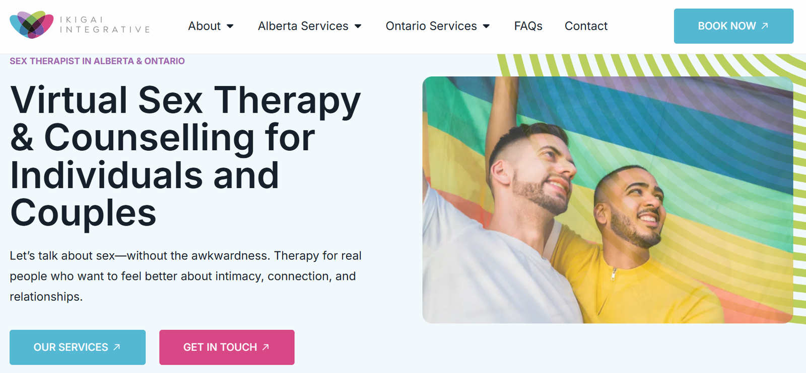
Ikigai Integrative handles a genuinely difficult positioning challenge well: it's a virtual sex therapy and counselling practice serving Alberta and Ontario, founded by a registered psychologist working to create a judgment-free space around topics that feel stigmatised in traditional settings.
What works:
- The copy directly acknowledges the discomfort clients may feel, which builds trust faster than pretending the topic isn't sensitive
- Specialty-specific FAQ content answers the questions a visitor is too embarrassed to ask out loud
- The site doesn't over-explain it respects that visitors researching this topic want privacy, not a wall of text
If your practice serves a specific niche like this, your content strategy matters as much as your design. This is where healthcare content marketing does the heavy lifting niche audiences find you through the specific questions you answer, not generic homepage copy.
What could improve: More visible credential/licence information near the top of the page would strengthen trust for a topic this sensitive.
5. Portland Talk Club
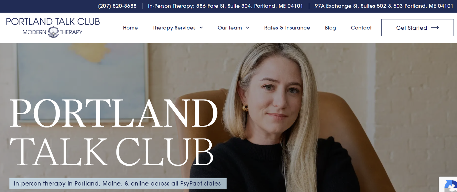
Portland Talk Club skips the stock-photo-of-someone-staring-out-a-window approach that dominates therapist websites, and instead invests in custom photography that reflects their actual space and people.
What works:
- Distinct visual identity from the first scroll you know exactly who this practice is for within seconds
- Custom photography over stock photos, which builds far more trust and feels significantly less generic
- A clear "who we serve" statement instead of trying to be everything to everyone
This is a strong case study if you want proof that differentiated branding actually pays off for more examples of practices standing out through smart positioning, see our roundup of healthcare marketing examples.
What could improve: Bold branding is a double-edged sword it can alienate visitors who don't relate to the aesthetic. Worth A/B testing against a more neutral variant if conversion data shows drop-off.
6. Toronto Psychotherapy Space
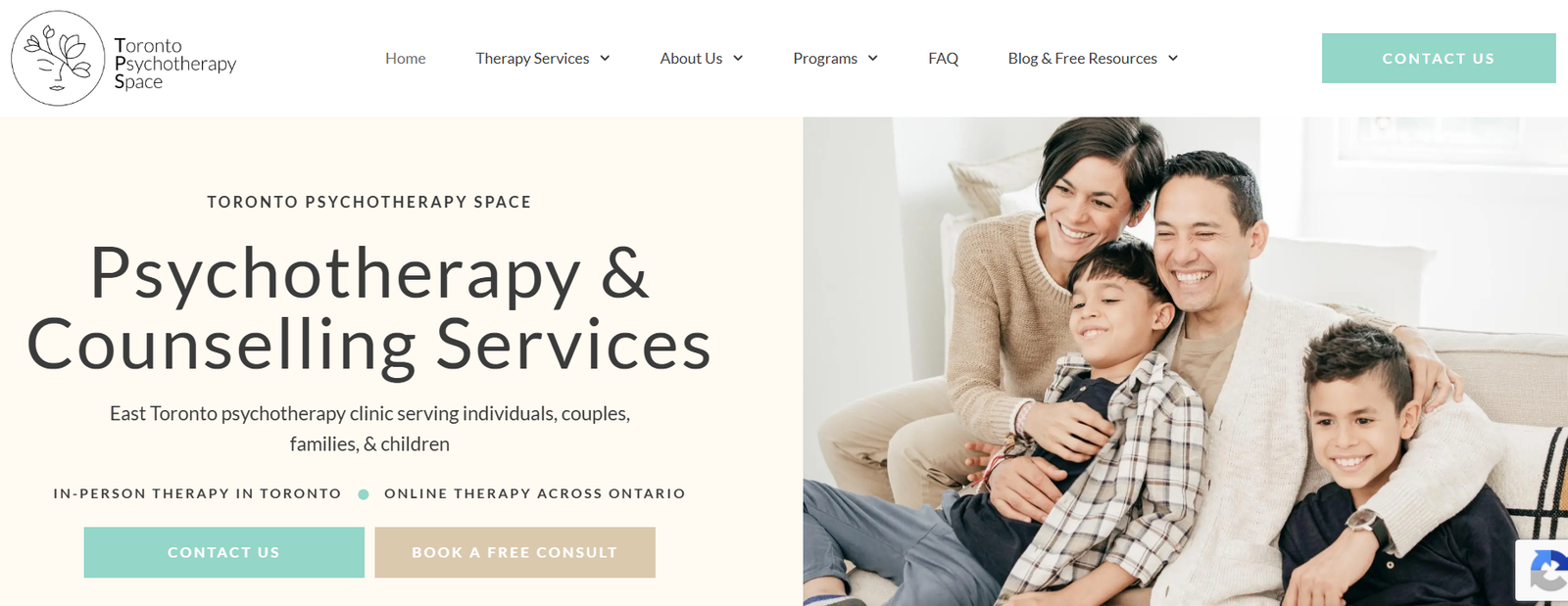
Large practices need systems that let visitors self-navigate filters, direct booking links, and condition-specific landing pages aren't optional at scale, they're essential and Toronto Psychotherapy Space handles this well.
What works:
- Filterable therapist directory means visitors can sort by specialty, availability, or approach without contacting the office first
- Condition-specific landing pages (e.g. a dedicated page for anxiety therapy vs. couples therapy) target long-tail search terms individually
- Clear internal linking between therapist bios and their specialty pages keeps visitors and search engines moving through the site logically
This kind of page architecture is a core part of any digital marketing strategy for healthcare practices with multiple providers each specialty page is a separate opportunity to rank.
What could improve: With this many landing pages, a clear breadcrumb trail and internal search function become important so visitors don't get lost.
7. Individual and Relationship Therapy

This Denver-based practice does something clever with their team photos: hovering over a therapist's professional headshot swaps it for a photo of them as a child.
What works:
- The hover effect makes practitioners feel real and approachable rather than intimidating
- Multiple contact options (call, email, schedule online) are all visible without scrolling
- Office photography helps visitors mentally prepare for what an in-person visit will actually feel like
For practices specifically trying to grow a local client base like this one, it's worth reading our guide on how to market your private practice a lot of what makes this site work ties directly into local trust-building tactics.
What could improve: Their lead magnet is placed at the very bottom of the homepage moving it higher would likely improve opt-in rates significantly.
8. Southern California Counseling

This nonprofit counselling centre takes an unusual visual approach: combining a real photo with an illustrated element in their hero image, which makes it easier for any visitor to picture themselves as a future client.
What works:
- A well-produced homepage video explains the centre's history and mission without requiring a full read-through
- The "Who We Are" team section uses candid, varied photography instead of a wall of identical corporate headshots
- The unconventional hero image makes the practice memorable in a sea of near-identical competitor sites
Larger, multi-service healthcare organisations looking to replicate this kind of brand storytelling at scale often work with a dedicated healthcare marketing services partner to keep video, photography, and messaging consistent across every page.
What could improve: The rotating image slider on their homepage is worth removing sliders are known to lower click-through rates since visitors tend to passively watch instead of taking action.
9. Begin Counseling
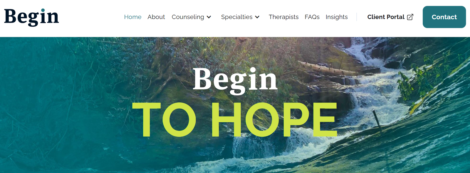
Begin Counseling, a trauma therapy practice, uses a subtle but effective visual metaphor: their hero images transition from monotone to a warm ray of colour, visually reinforcing their message that "things will get better."
What works:
- The visual metaphor reinforces the copy instead of just decorating the page
- Built on a flexible platform (Webflow) that allows this kind of custom animation without sacrificing load speed
- Local, regional nature photography ties the brand to a specific place rather than feeling like generic stock content
If you're planning your own build and want a broader look at what goes into a strong healthcare site from the ground up, our guide on how to make a medical website covers the technical fundamentals this kind of design still needs to sit on top of.
What could improve: Custom animations like this need proper alt text and reduced-motion settings to stay accessible for visitors using screen readers or those sensitive to motion worth auditing before launch.
10. Thriveworks
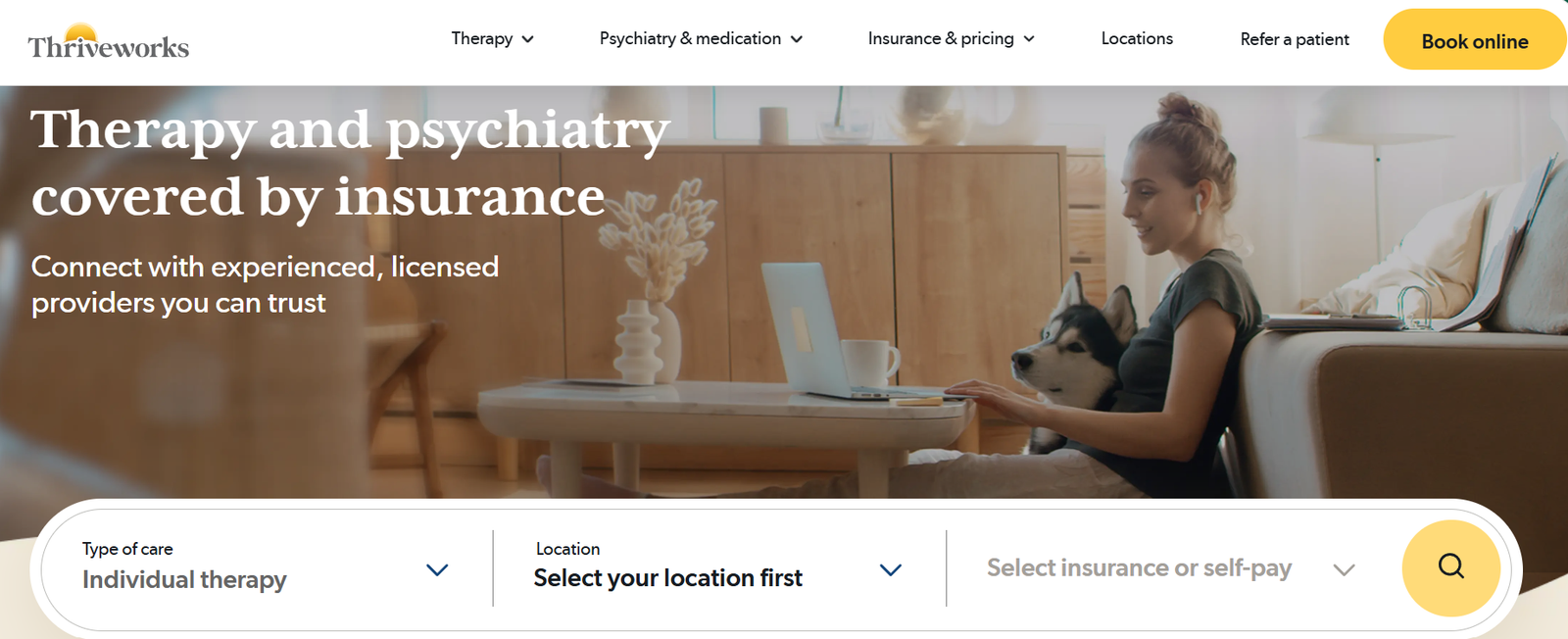
Thriveworks does something almost no other site on this list attempts: a dual call-to-action directly in the hero image (one button to call, one to book online) plus a live chat option.
What works:
- Two distinct CTAs acknowledge that some visitors want to talk to a human and others want to self-serve entirely online
- Live chat is genuinely rare among therapist websites and when properly staffed measurably increases engagement
- As a large multi-location practice, their scale means they also lean heavily on directories like Psychology Today for visibility, which is worth understanding if you're weighing the same approach; our guide on creating a Psychology Today profile walks through the setup
What could improve: Their homepage displays a large number of media logos with no context for what they represent trust badges only work if visitors understand what they mean. A curated set of client reviews would build more credibility than an unexplained logo wall. If client acquisition is the real goal here, it's also worth reading our breakdown on how to get more therapy clients website design is one piece of a much bigger funnel.
11. Mary DiOrio Psychotherapy
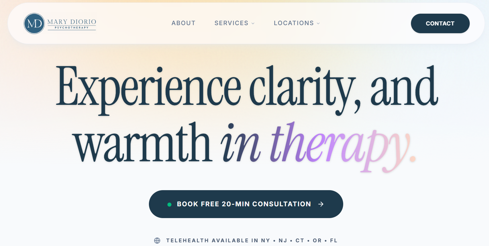
Here's something you won't see in most "best therapist websites" lists: a before-and-after. Mary DiOrio's site has been floating around therapist website roundups since 2019. But here's the thing the version being praised back then isn't the version that's live today. She rebuilt it.
What works now:
- The homepage leads with a specific credibility statement (20+ years, Columbia University faculty) instead of a generic welcome message
- Specialties are named plainly anxiety, depression, eating disorders, couples therapy with zero vague "here to help" filler
- A dedicated referral page for healthcare providers is a smart, rarely-used addition it treats doctors and other clinicians as a real acquisition channel, not just an afterthought
What could improve: The referral page currently uses a placeholder-style phone number format, which is a small but easy fix worth catching before it costs a real referral.
The lesson here isn't really about Mary's site. It's this: a "best of" list from 2019 tells you almost nothing about what a site looks like today. Six years is a long time on the internet. Always check.
12. WILA - Wright Institute Los Angeles
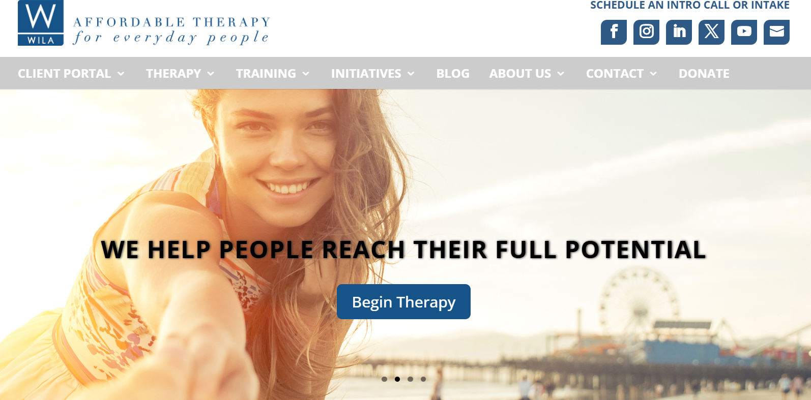
WILA doesn't try to be everything to everyone. It's a nonprofit. It offers sliding-scale therapy. And it says so, clearly, in the first sentence a visitor reads.
What works:
- The intake process is laid out step by step call, get a portal link, complete an intake interview which removes almost all of the "what happens next?" anxiety
- Pricing is addressed honestly upfront instead of being hidden behind a "contact us for rates" wall, which builds trust fast with a budget-conscious audience
- The mission statement doubles as a filter: it tells the right visitor "you're in the right place" and quietly tells the wrong visitor to look elsewhere
What could improve: As a nonprofit training centre, WILA also serves prospective clinicians and trainees. Right now that audience and the client-seeking-therapy audience share the same navigation, which adds a small amount of friction. Separate paths for each visitor type would clean this up.
13. SHIFRA
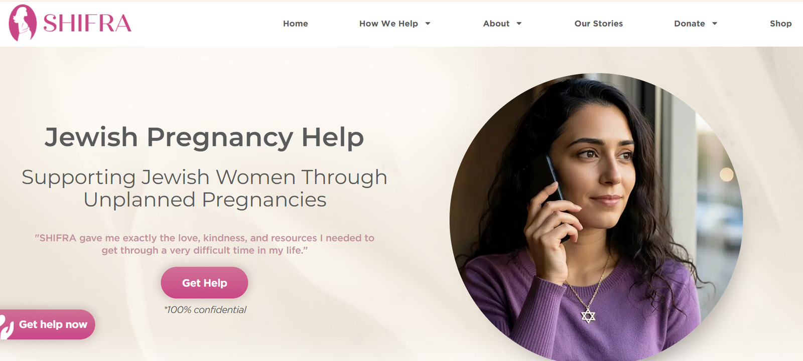
This one's a genuinely hard brief: a nonprofit supporting Jewish women through unplanned pregnancy, serving people across the entire spectrum of belief on a deeply personal issue. SHIFRA pulls it off.
What works:
- The copy explicitly states the organisation brings together people with very different views, because the support itself matters more than agreement a smart way to build trust with a wide, wary audience
- Multiple low-commitment contact options (helpline, text line, online form) meet visitors at whatever comfort level they're at
- The tone throughout is warm and non-judgmental without ever feeling clinical a genuinely difficult balance to strike
SEO note: Notice the rebrand this practice used to go by "In Shifra's Arms" and now operates as "SHIFRA," on the same domain. That's a meaningful brand change, and it's a good reminder to set up proper redirects and update your Google Business Profile any time you rename a practice, so you don't lose the rankings you already earned.
What could improve: With a name change this significant, older backlinks and directory listings referencing the old name are worth auditing and updating.
14. Ground Work Play Therapy
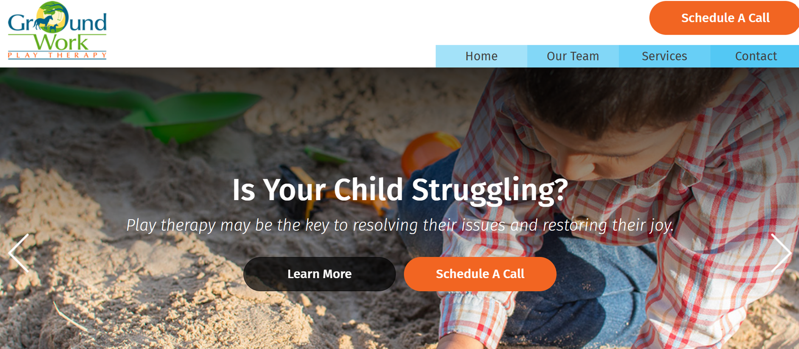
Play therapy is a niche within a niche. The clients are children. The decision-makers are parents. And Ground Work Play Therapy's site is built for exactly that audience.
What works:
- The tone is warm and simple, without being childish it speaks to the parent doing the research, not the child who'll eventually sit in the room
- Services are explained in plain language: what play therapy is, why it helps, and what a first appointment looks like
- Contact information is short, direct, and repeated a phone number and a simple form, nothing overcomplicated
What could improve: As a small nonprofit, this site would benefit from a few client (parent) testimonials. Right now the trust-building rests almost entirely on the "About" and "Our Team" pages.
15. Minaa B.

Minaa B. isn't just a therapist. She's an author, a podcast host, and a recognised name in mental health media. Her site reflects that and it's a genuinely useful example if your own personal brand is part of your practice's growth strategy.
What works:
- "Featured in" media logos are used the right way here: specific, recognisable outlets, directly tied to her actual media appearances not an unexplained logo wall
- The design feels closer to a premium editorial site than a typical therapy homepage, which reinforces her positioning as a thought leader, not just a service provider
- Clear pathways exist for different visitor types people looking for 1:1 therapy, and organisations looking to book her as a speaker without either audience feeling like an afterthought
What could improve: With two very different audiences (therapy clients and corporate/speaking clients) sharing one homepage, a clearer top-level split between "work with me 1:1" and "book me to speak" would reduce any early confusion.
16. Therapy with Gayane
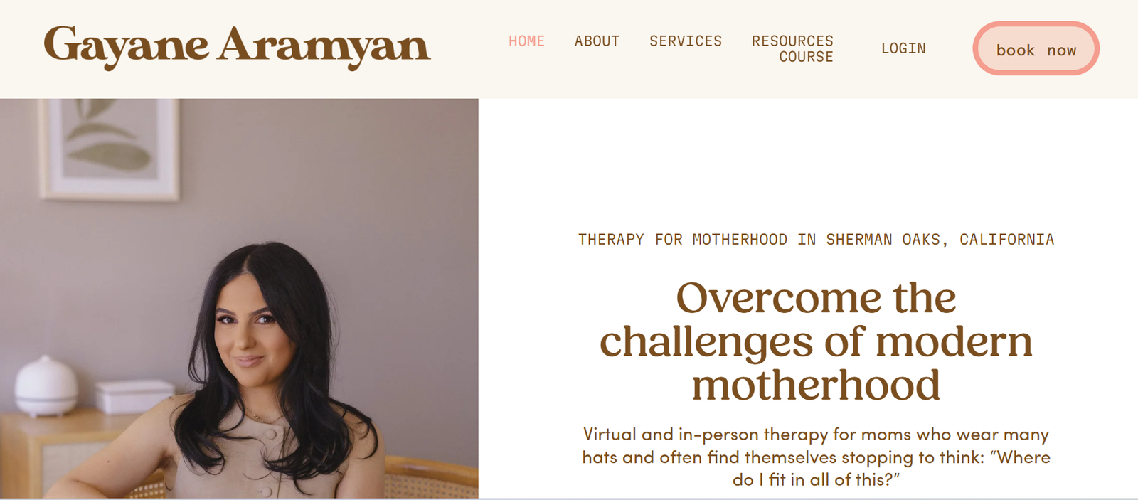
Gayane Aramyan doesn't market herself as a general therapist. She markets herself specifically to mothers navigating postpartum, identity shifts, and the mental load of parenting. That specificity is the whole point.
What works:
- The homepage copy reads like it was written by someone who's actually lived the experience she's treating conversational, specific, and instantly relatable to her exact audience
- Payment terms are stated clearly and honestly: private pay, no insurance billing, with an offer to provide a superbill for reimbursement no ambiguity, no surprise at checkout
- A dedicated media page listing podcast and press appearances builds authority without needing a single client testimonial
What could improve: There's no visible pricing range anywhere on the site. For a private-pay practice, even a rough range ("sessions start at $X") tends to reduce the number of visitors who bounce before ever reaching out.
How We're Evaluating These Therapist Website Examples
Before the list, here's the criteria. This matters because "good design" is subjective, but a website that gets clients in the door isn't it either works or it doesn't. We're scoring every site on:
- Trust signals. Credentials, license numbers, real photos, and specific specialties not vague "here to help" copy.
- Booking friction. Can a visitor go from homepage to booked consultation in under 30 seconds?
- HIPAA and GDPR-compliant forms. Any intake, contact, or scheduling form needs to handle client data securely this isn't optional in healthcare.
- Design tone. Calming colour palettes, legible fonts, and photography that doesn't feel clinical or stock.
- Mobile performance and page speed. Most therapy searches happen on a phone, so slow load times cost you clients before they even see your homepage.
- Basic on-page SEO. Title tags, header structure, schema markup, and internal linking the stuff that decides whether anyone finds this beautiful website in the first place.
That last point is where a lot of "great-looking" therapist websites quietly fall apart. Design and SEO have to work together a gorgeous site nobody can find isn't converting anyone.
If you're mapping out a build of your own, it also helps to know how much a healthcare website typically costs to build before you start comparing examples it'll change what you consider "realistic" as you go through this list.
Quick Comparison: Which Example Fits Your Practice?
| Website | Best For | Standout Feature |
|---|---|---|
| Deep Eddy Psychotherapy | Solo/small practices | Confident, location-specific copywriting |
| Couples Learn | Trust-building | Curated reviews + visible HIPAA and GDPR compliance |
| Wholeness Collective | Calming visual design | Soft palette, floating header |
| Ikigai Integrative | Sensitive/niche specialties | Judgment-free, specific positioning |
| Portland Talk Club | Standout branding | Custom photography, distinct identity |
| Toronto Psychotherapy Space | Large group practices | Filterable directory, specialty pages |
| Individual & Relationship Therapy Center | Personal connection | Interactive "human" about page |
| Southern California Counseling Center | Nonprofits/centres | Homepage video, candid team photos |
| Begin Counseling | Trauma-informed branding | Visual storytelling through colour |
| Thriveworks | Multi-location scale | Dual CTA + live chat |
| Mary DiOrio Psychotherapy | Referral-driven practices | Dedicated healthcare provider referral page |
| WILA | Nonprofit/sliding-scale practices | Honest, step-by-step intake process |
| SHIFRA | Sensitive/divisive topics | Non-judgmental, multi-channel trust building |
| Ground Work Play Therapy | Child/family-focused practices | Parent-first, plain-language messaging |
| Minaa B. | Personal-brand practitioners | Editorial design + media credibility |
| Therapy with Gayane | Micro-niche solo practices | Hyper-specific audience messaging |
Our comparison of the best website builders for therapists breaks down where each option hits its ceiling, and this list of top therapy practice management software is worth a read before you finalise your booking flow.
How to Choose a Web Design Partner for Your Therapy Practice
Here's the thing: a nice-looking website that nobody finds, and nobody trusts enough to book with, isn't actually a good website. It's expensive digital wallpaper.
When you're evaluating a design partner whether that's us or someone else ask about these three things specifically:
- Healthcare and compliance experience. Ask directly whether they've built HIPAA and GDPR-compliant intake forms before, and whether they understand GDPR requirements if you're serving UK clients. This isn't a "nice to have" it's a liability issue if it's handled wrong.
- SEO built in from day one, not added later. A site built without proper title tags, schema markup, and page-speed optimisation from the start almost always needs an expensive rebuild within 18 months. Our guide to keyword research for healthcare covers fundamentals that apply just as directly to therapy practices.
- Ongoing support, not just a handoff. Websites aren't "set and forget." Plans, providers, specialties, and even compliance requirements change. Ask what happens after launch do you own the content management system, and is there a support plan in place?
If you're a life coach rather than a licensed therapist, a lot of this still applies see our related breakdown of life coaching website examples for a niche-specific version of this same framework.
Beyond the build itself, most practices eventually need the surrounding pieces too: healthcare SEO services to actually get found, healthcare content marketing services to keep answering client questions long after launch, social media management for healthcare to stay visible between visits, and healthcare PPC services if you want paid visibility while your organic rankings build a topic we cover in more depth in our guide to healthcare PPC. For the full technical build itself, our healthcare web design and development service covers everything from the examples above, end to end.
We work with practices across the US and UK, including a growing number of England-based practices navigating GDPR alongside standard healthcare compliance you can see our full location coverage here.
Also Read: Is Psychology Today a Reliable Source? →Frequently Asked Questions
Looking for more inspiration across healthcare? Browse the rest of our blog for guides on SEO, content, and marketing built specifically for healthcare practices.